Commercial Law · Marina Bay, Singapore
Commercial Law · Marina Bay, Singapore
The Brief
A boutique commercial litigation firm in Singapore's Marina Bay Financial Centre. Six senior partners, cross-border disputes across Southeast Asia, established 2008. Entire client pipeline ran through referrals. No website, no verifiable online presence — prospects couldn't qualify the firm before the first call.
The Challenge
Law firms bifurcate much like restaurants: cheap-looking directories, or overwrought agency sites drowning in stock imagery of handshakes and gavels. Meridian needed neither. The challenge was building something that communicated institutional weight and earned trust without a single piece of decorative imagery.
The Approach
White background, not dark. This was the first and most important decision, and it required resisting every instinct to go premium-dark. White signals transparency. Navy (#0f1923) as the primary text colour is darker and more authoritative than black — the colour of a properly pressed suit. Gold (#9a7d4a) at a lower saturation than the portfolio's gold, because this client doesn't announce itself.
EB Garamond headings capped at 56px. Most sites treat "big type = confidence". Meridian's message is the opposite: precise sizing, generous line-height, nothing that shouts. The sophistication is in what isn't there.
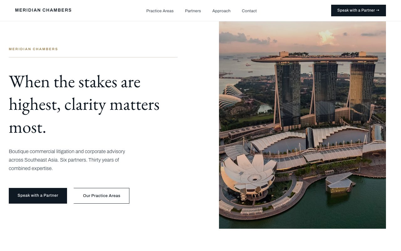
Left-aligned hero with Singapore skyline photography occupying the right column — the visual language of a Bloomberg terminal or a Financial Times layout. GSAP reveal at 1.2 seconds, ease-in-out. The pace of someone who has read many contracts.
Tech Stack
Technical Decisions
50/50 grid — text column left, skyline image right — against the centred convention. The asymmetry reads as editorial confidence, not design indecision.
#9a7d4a not #c9a84c — lower chroma reads as aged rather than decorative. The difference is felt before it's seen.
4 anonymised matters in Garamond italic — the restraint of not being able to name clients is itself a trust signal. Discretion as brand value.